HubSpot
Role: UI Designer | Date : 2022 - 2023 | Client: Hubspot

Role: UI Designer | Date : 2022 - 2023 | Client: Hubspot

HubSpot's homepage needed to better communicate its value propositions to diverse audiences while improving conversion rates. The existing design lacked visual hierarchy and failed to guide users effectively through the product ecosystem, resulting in lower engagement and unclear next steps for potential customers.
Inconsistent messaging across product tiers
Complex navigation is overwhelming users
Low click-through rates on key CTAs
Poor mobile experience is impacting 40% of traffic
A data-driven redesign focused on hierarchy, clarity, and conversion optimization through iterative testing and refinement.
Simplified navigation with clear user paths
Component-based design system for consistency
Mobile-first responsive framework
A/B tested layouts validated with real user data
Approach
My approach combined user research, rapid prototyping, and data validation to ensure every design decision was grounded in evidence and aligned with business goals.

Research & Analysis - Conducted user interviews, analyzed heat maps, and reviewed conversion funnel data to identify pain points
Ideation & Prototyping - Created multiple design variations, exploring different layouts and component structures

Testing & Validation - Ran A/B tests on component variations. Gathered feedback through user testing sessions with 30+ participants across different segments
Iteration & Launch - Refined designs based on test results and rolled out changes with engineering partners
Key Deliverables
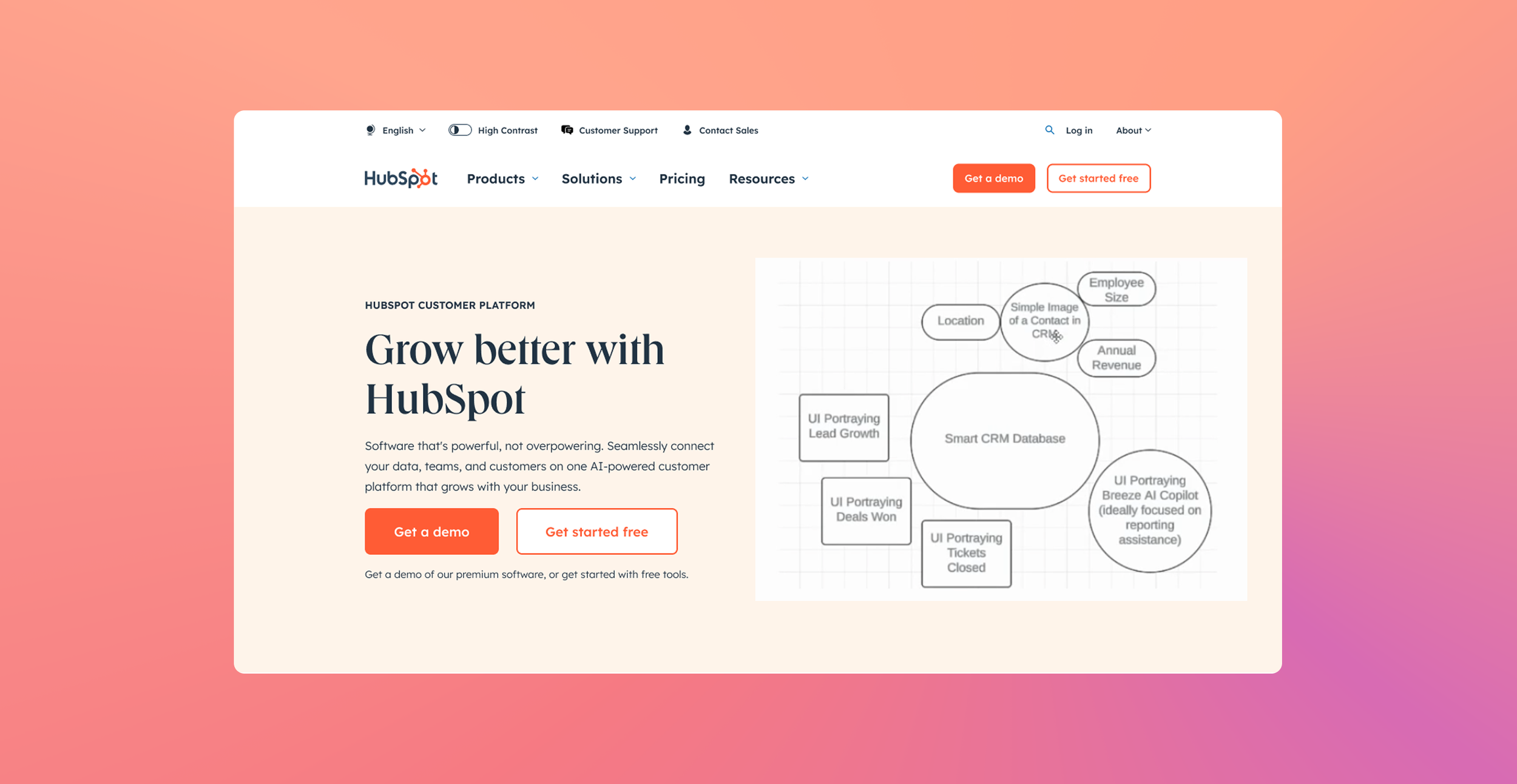
Brainstorming Process v1.1
Homepage Hero v1
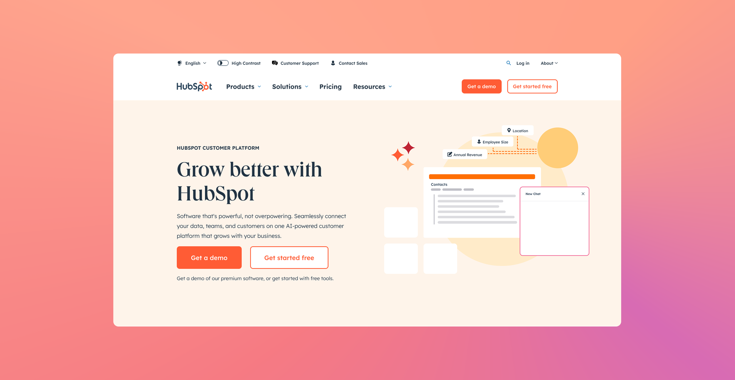
Brainstorming Process v1.2
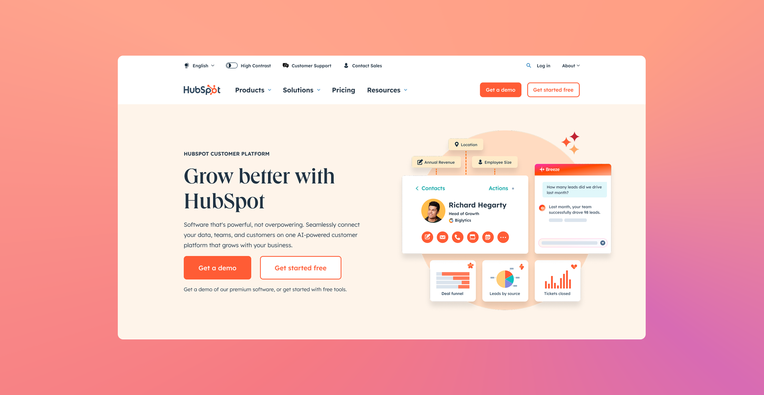
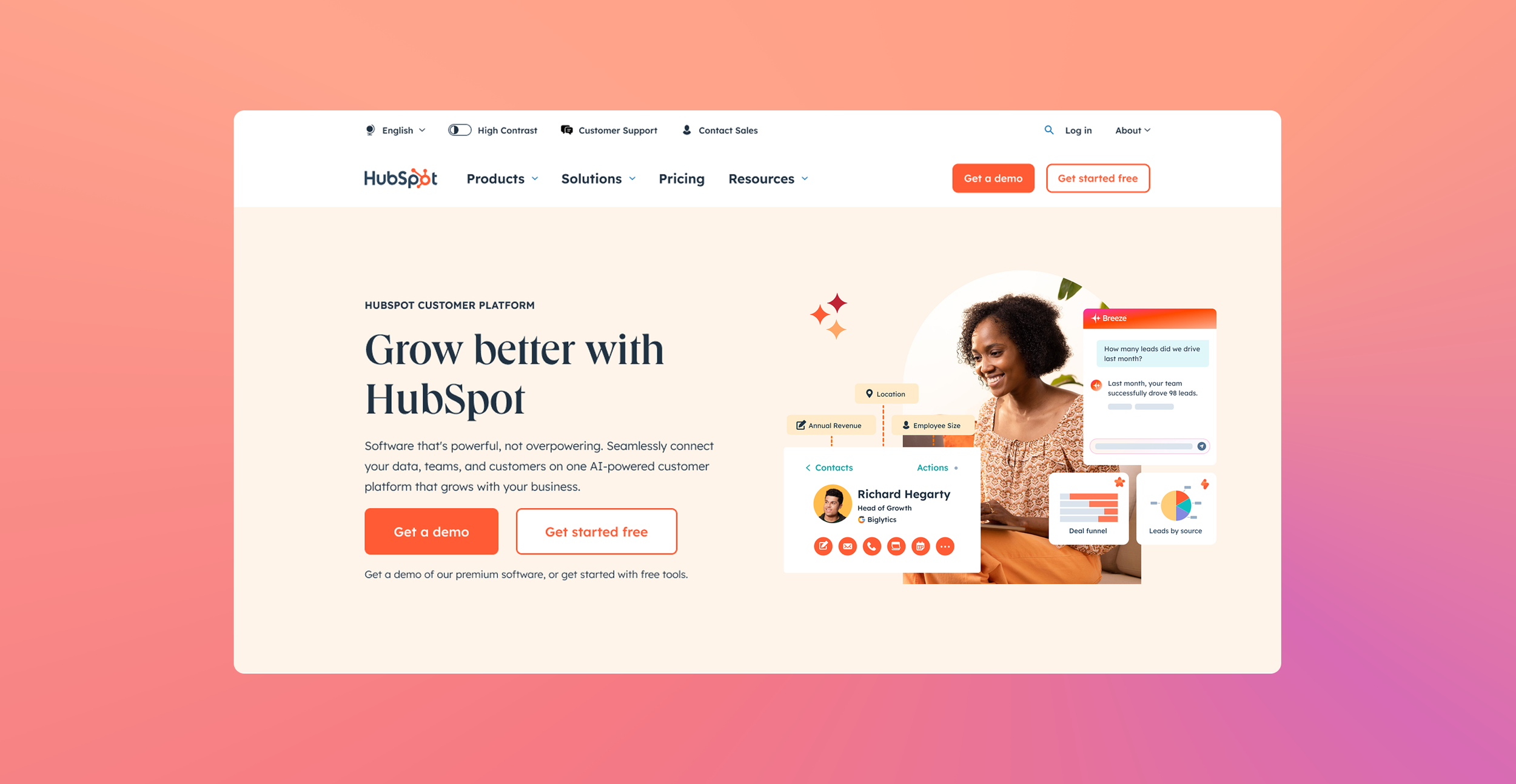
Homepage Hero v2
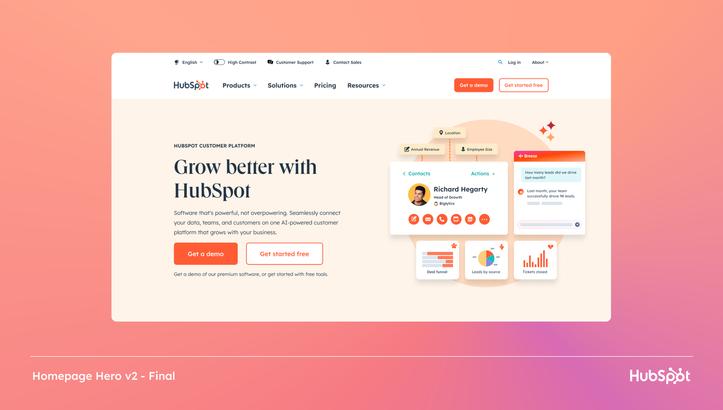
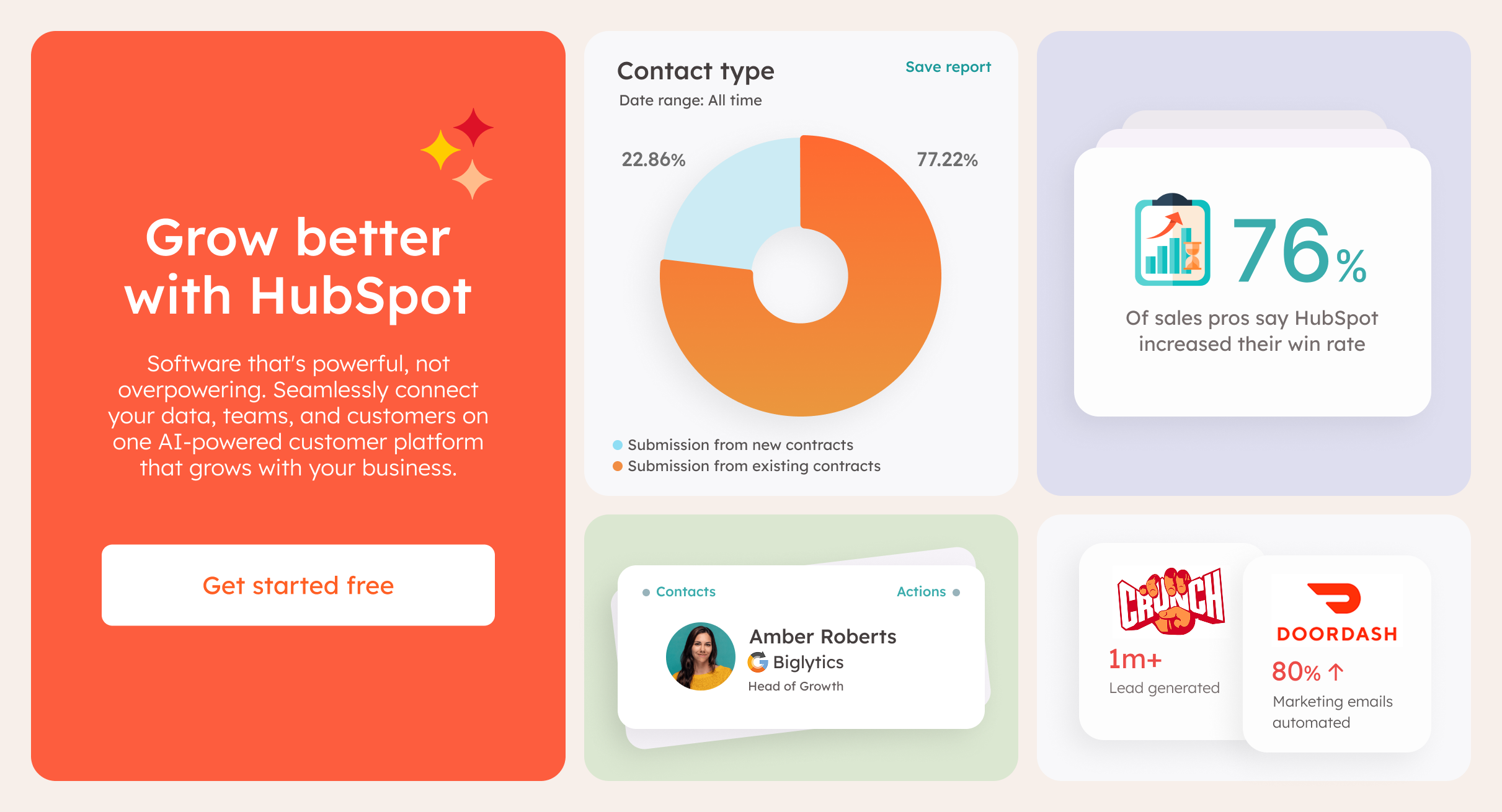
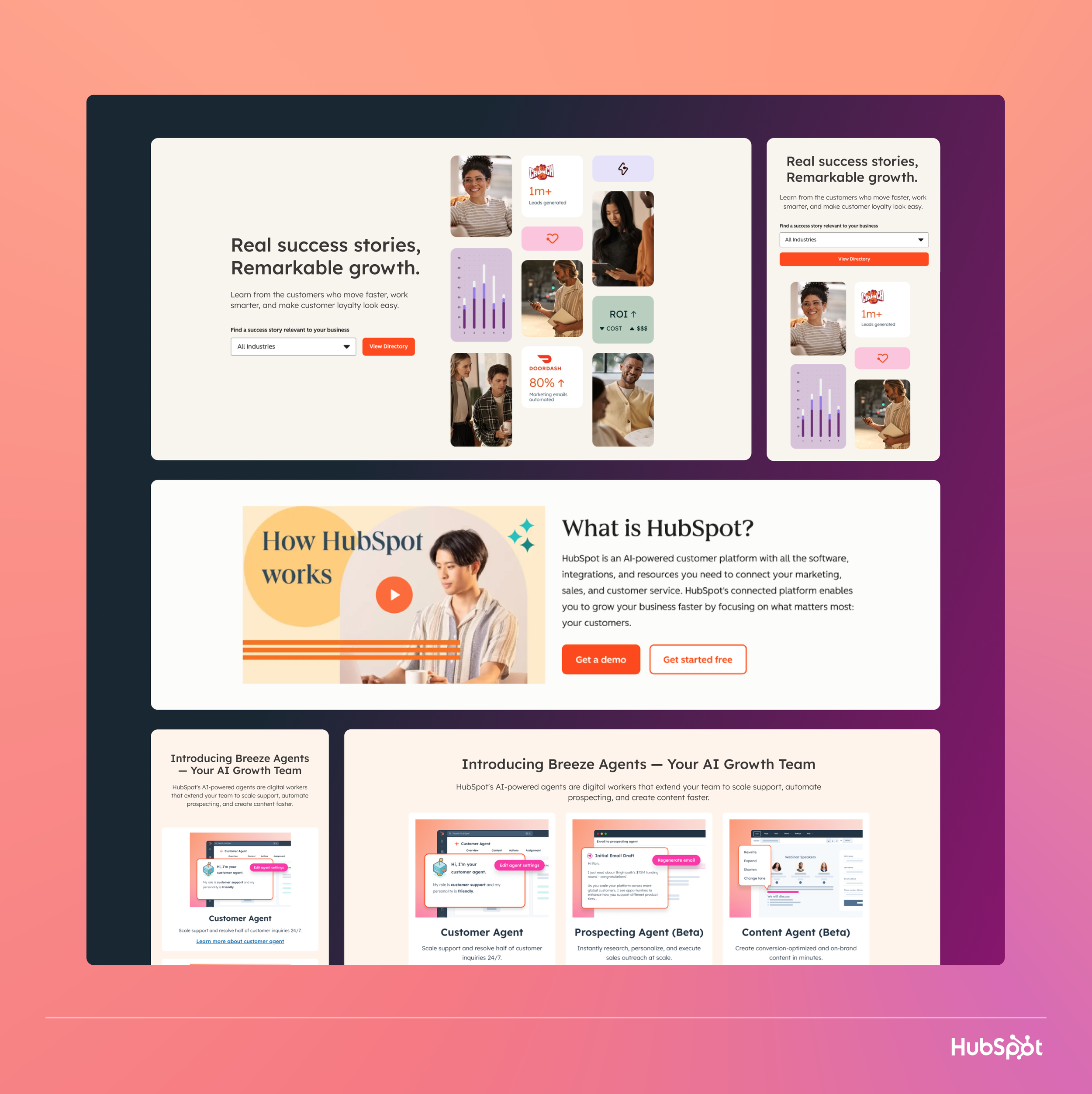
Redesigned the hero section to immediately communicate HubSpot's core value proposition. The new design features a clear headline hierarchy, compelling product imagery, and prominent CTAs that guide users toward conversion.
The hero was optimized through 12 rounds of A/B testing, ultimately achieving a 34% increase in click-through rate compared to the previous design.
Key Improvements
Simplified messaging hierarchy
Dynamic product visuals
Dual CTA strategy tested
Mobile-optimized layout
Reduced cognitive load
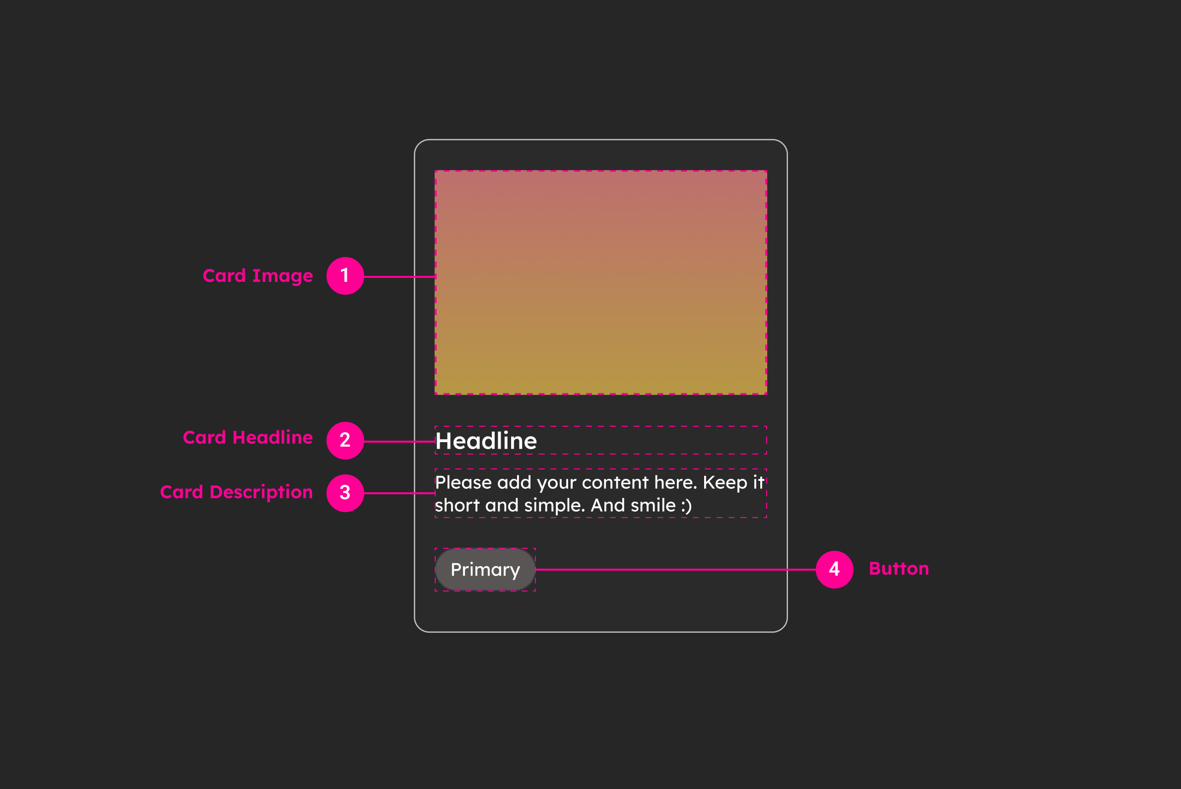
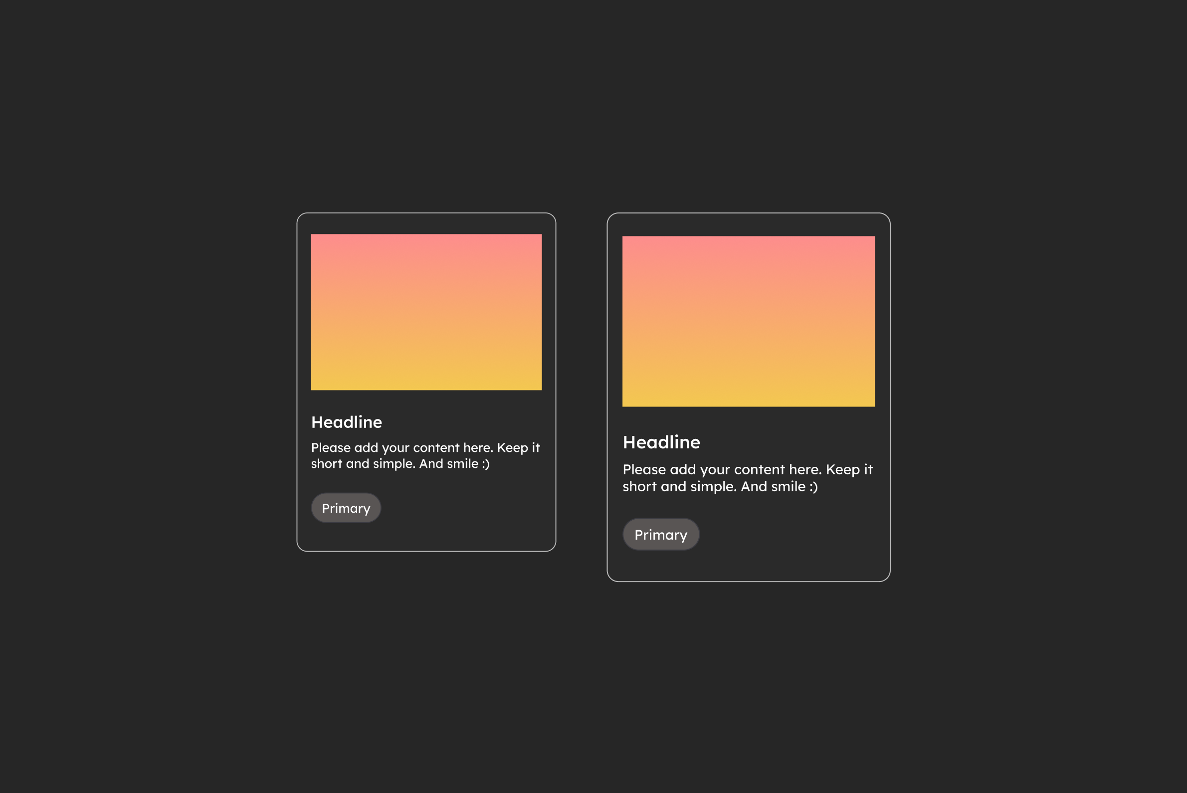
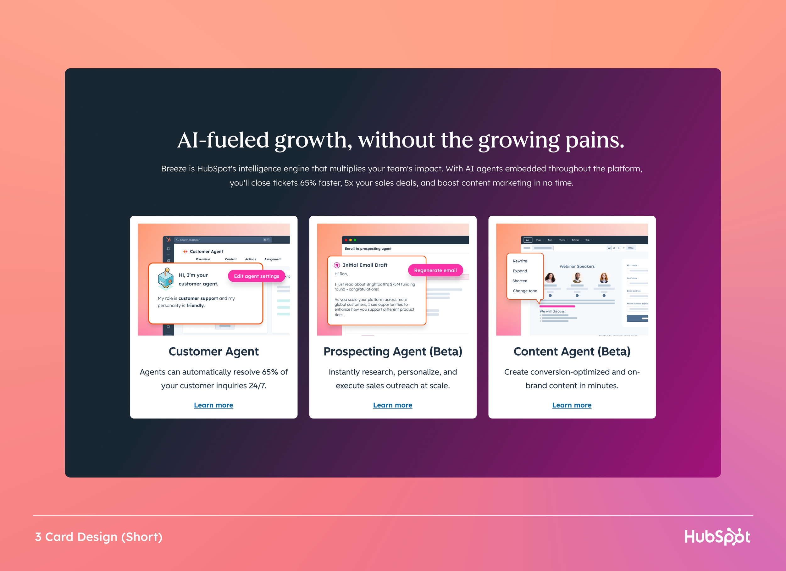
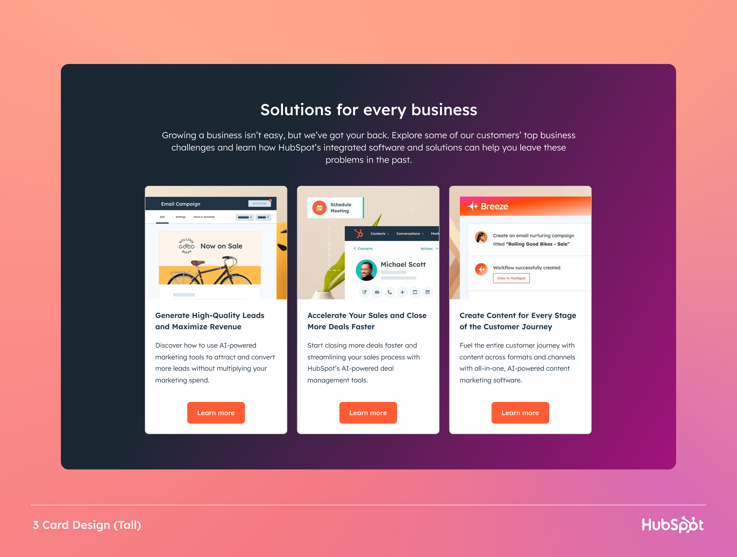
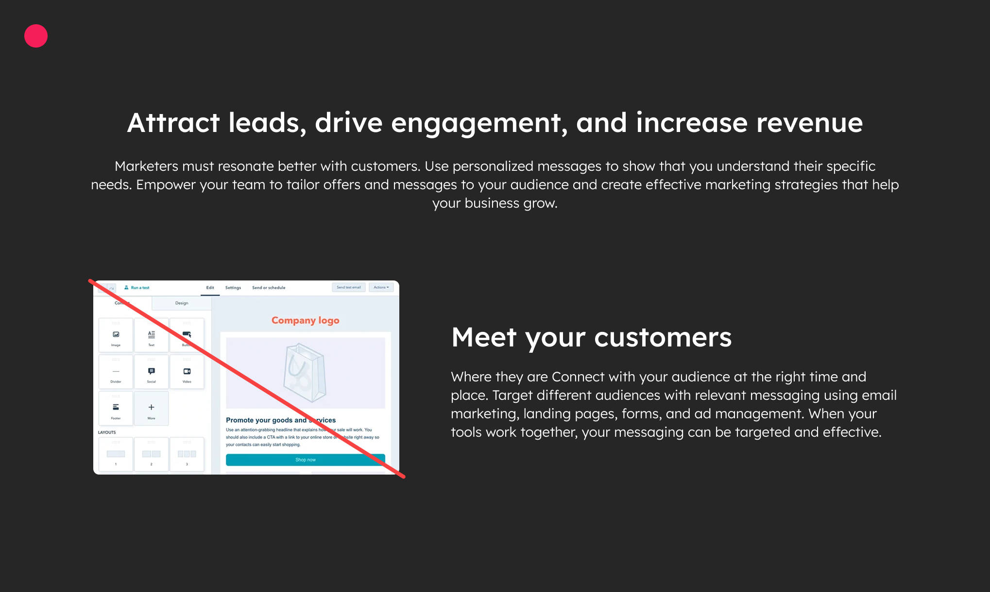
Designed a three-card module that breaks down HubSpot's platform into digestible value propositions. Each card uses visual storytelling, clear hierarchy, and strategic CTA placement to guide users deeper into the product ecosystem.
This component became a reusable pattern across the marketing site, maintaining consistency while allowing for contextual customization.
Design Principles
Scannable content structure
Contextual product imagery
Consistent CTA patterns
Responsive grid system
28% conversion increase
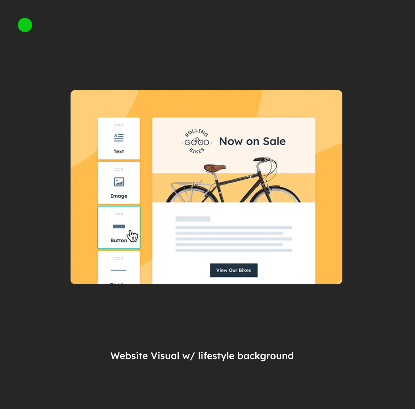
V1 w/abstract shapes BG
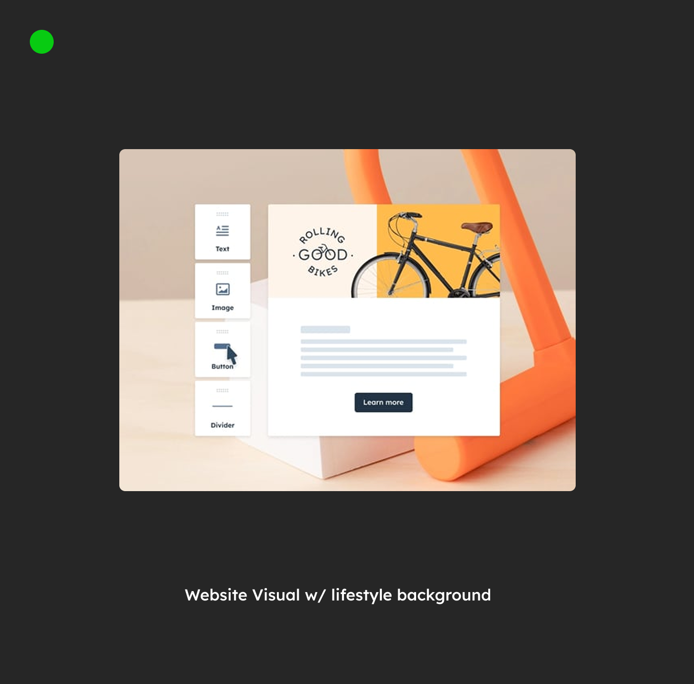
V2 w/lifestyle BG
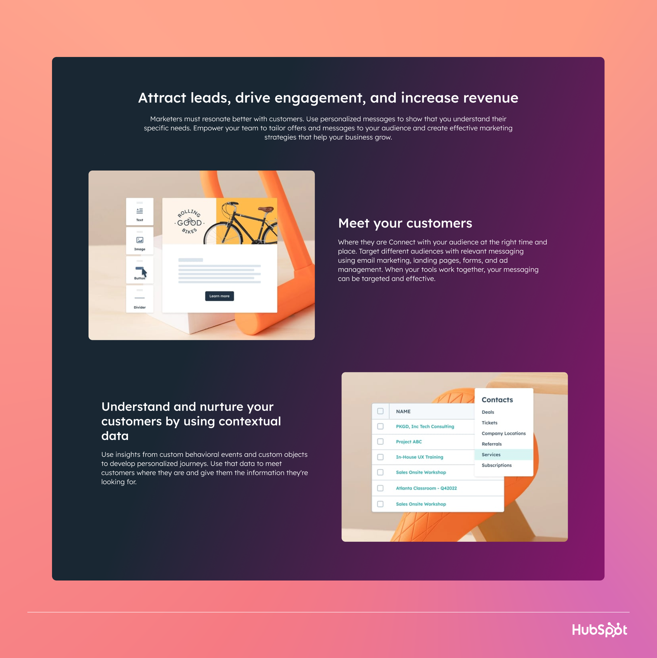
Created alternating left-right image-text layouts that maintain visual interest while presenting complex product features. The asymmetric rhythm prevents monotony and creates natural reading flow.
Each module includes strategic white space, progressive disclosure patterns, and secondary CTAs that allow users to explore at their own pace.
Notable Features
Asymmetric layouts
Progressive disclosure
Contextual animations
Flexible content grid
Cross-browser tested
Impact
The redesign delivered significant improvements across all key metrics, validating our hypothesis that clarity and hierarchy drive conversion. More importantly, we established a scalable design system that continues to support rapid iteration and testing.
34% increase in homepage click-through rate
28% lift in trial sign-up conversions
45% reduction in bounce rate on mobile
2.1M average monthly unique visitors
Maintained 99.9% uptime during rollout
Simplicity beats complexity in conversion design
Mobile-first thinking improved desktop metrics too
Consistent testing reveals unexpected insights
Design systems enable velocity without sacrificing quality
Collaboration between design and engineering drives success

HubSpot - Breeze Visual Design

Cisco - Mobile Apps

Instashop - Case Study