Instashop
Role: UX/UI Designer & Researcher |. Date : 2016 - 2017 | Client: Design Lab

Role: UX/UI Designer & Researcher |. Date : 2016 - 2017 | Client: Design Lab


With rapid advancements in technology and the growing demand for convenience, Instashop aims to reimagine the grocery shopping experience by providing an accessible online alternative. This case study documents the complete design process from initial research through to final designs and impact assessment.
How might we create an online grocery shopping experience that feels intuitive, trustworthy, and convenient enough to convert traditional in-store shoppers into digital users?


Primary Goals
Target Audience

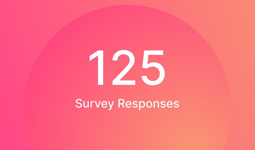
73% of respondents cited "lack of time" as their primary frustration with traditional grocery shopping. Users want to complete their shopping in under 15 minutes.

82% of users actively compare prices across stores. They expect the platform to help them save money, not just time.

68% expressed concerns about not being able to select their own produce. Users need transparency in freshness guarantees and quality standards.

91% of potential users would prefer to shop on their mobile device during commutes or breaks. Desktop experience is secondary.
— Survey Participant, Working Professional, Age 32


Through card sorting sessions with users, we validated the site structure to ensure intuitive navigation aligned with users' mental models of grocery shopping.

Low-fidelity wireframes established the foundational layout and user flows, prioritizing core functionality before visual design.

Homepage - Quick access to categories, search, and personalized recommendations

Checkout Flow - Streamlined process with delivery scheduling and payment options
Product Browsing - Filter options, sorting, and visual product cards for easy scanning
The moodboard captured an urban, modern aesthetic that balances energy with approachability—reflecting the fast-paced lifestyle of our target users while maintaining warmth and trustworthiness.


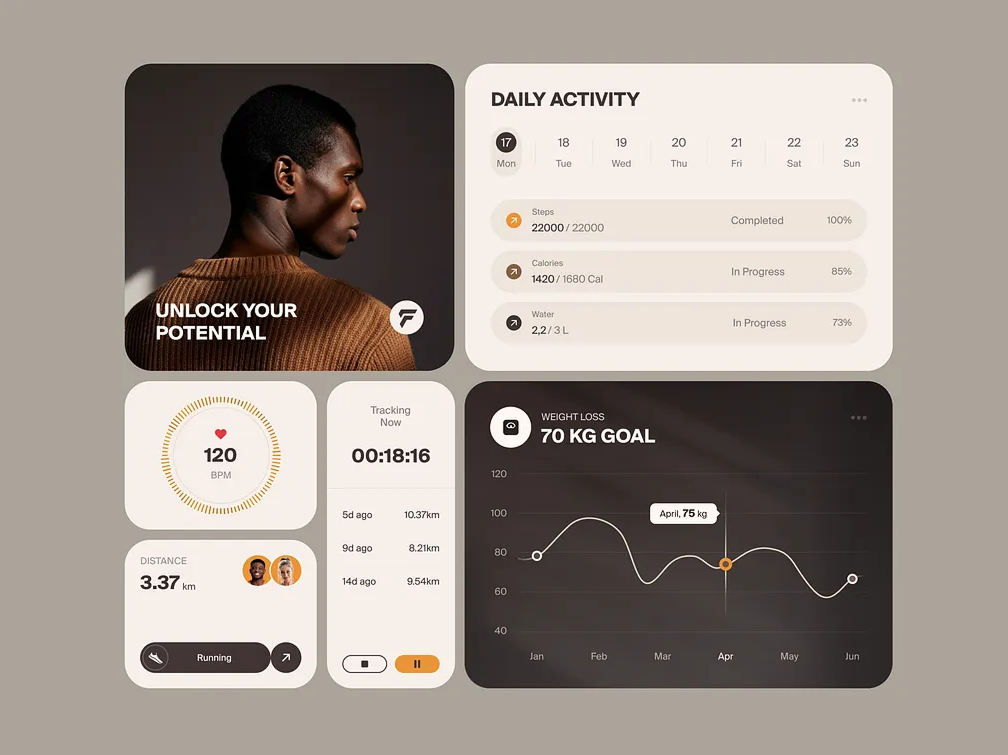
Visual indicators showing product freshness dates and quality standards, addressing users' top concern about produce quality.
Integrated price tracking shows users when items are on sale or at their lowest price point.
AI-powered lists that learn from past purchases and suggest frequently bought items, saving users time.
Quick access to past orders with automatic cart population for regular grocery runs.
Users prefer a fast, simple experience over complex personalization options they have to configure.
Users shop differently for weekly hauls vs. quick dinner ingredients—the interface needed to support both modes.
85% of test sessions were conducted on mobile devices, confirming our design priority.
Every major design decision was validated by user feedback, preventing costly assumptions.
— Usability Test Participant

HubSpot - Design Strategy

Cisco - Design Systems

Cisco - Mobile Apps