

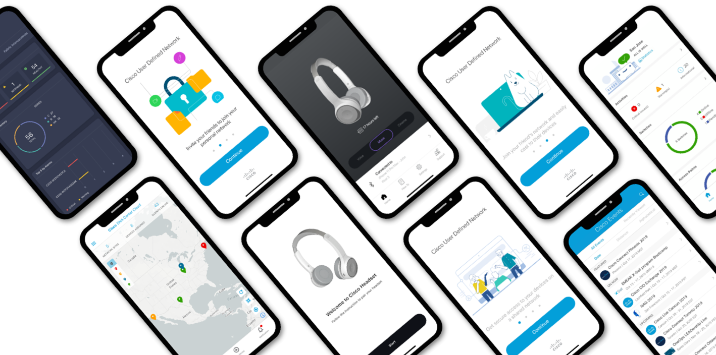

Mobile Apps
Role: I serve as an advisor to stakeholders, reviewing their mobile app designs and discussing their goals and thought processes. After each review, I provide actionable feedback and, when needed, create mockups to enhance the app’s look and feel, ensuring alignment with Cisco’s design standards and compliance with the latest iOS and Android guidelines.


App Icon Guidelines
Focus on a single element: Choose one core element that represents your app and simplify it into a clean shape. Add details sparingly, as complex shapes can be hard to read at small sizes.
Keep it simple: Less is more. Avoid clutter or unnecessary embellishments.
Avoid photos or screenshots: Photographic details and interface elements are difficult to see at small sizes and can cause confusion for users. Stick to a clear, symbolic representation of your app.


Mobile App Navigation (Research Insights)
Effective mobile navigation requires designing for small screens and touch gestures. Minimize clutter by optimizing element size, number, labels, and supporting content. Prioritize thumb-friendly interactions and follow OS conventions and standard navigation patterns for the best user experience.