Cisco Mobile Apps
Role: UI Designer | Date : 2018 - 2019 | Client: Cisco

Role: UI Designer | Date : 2018 - 2019 | Client: Cisco

I serve as an advisor to stakeholders, reviewing their mobile app designs and discussing their goals and thought processes. After each review, I provide actionable feedback and, when needed, create mockups to enhance the app's look and feel, ensuring alignment with Cisco's design standards and compliance with the latest iOS and Android guidelines.
A structured approach to mobile design excellence

Initial Review - Analyze app designs against iOS/Android HIG, Cisco brand standards, and accessibility requirements

Stakeholder Discussion - Meet with teams to understand goals, constraints, and user needs while identifying opportunities

Actionable Feedback - Deliver prioritized recommendations with specific examples and best practice references

Mockup Creation - Design high-fidelity mockups demonstrating proposed improvements when needed
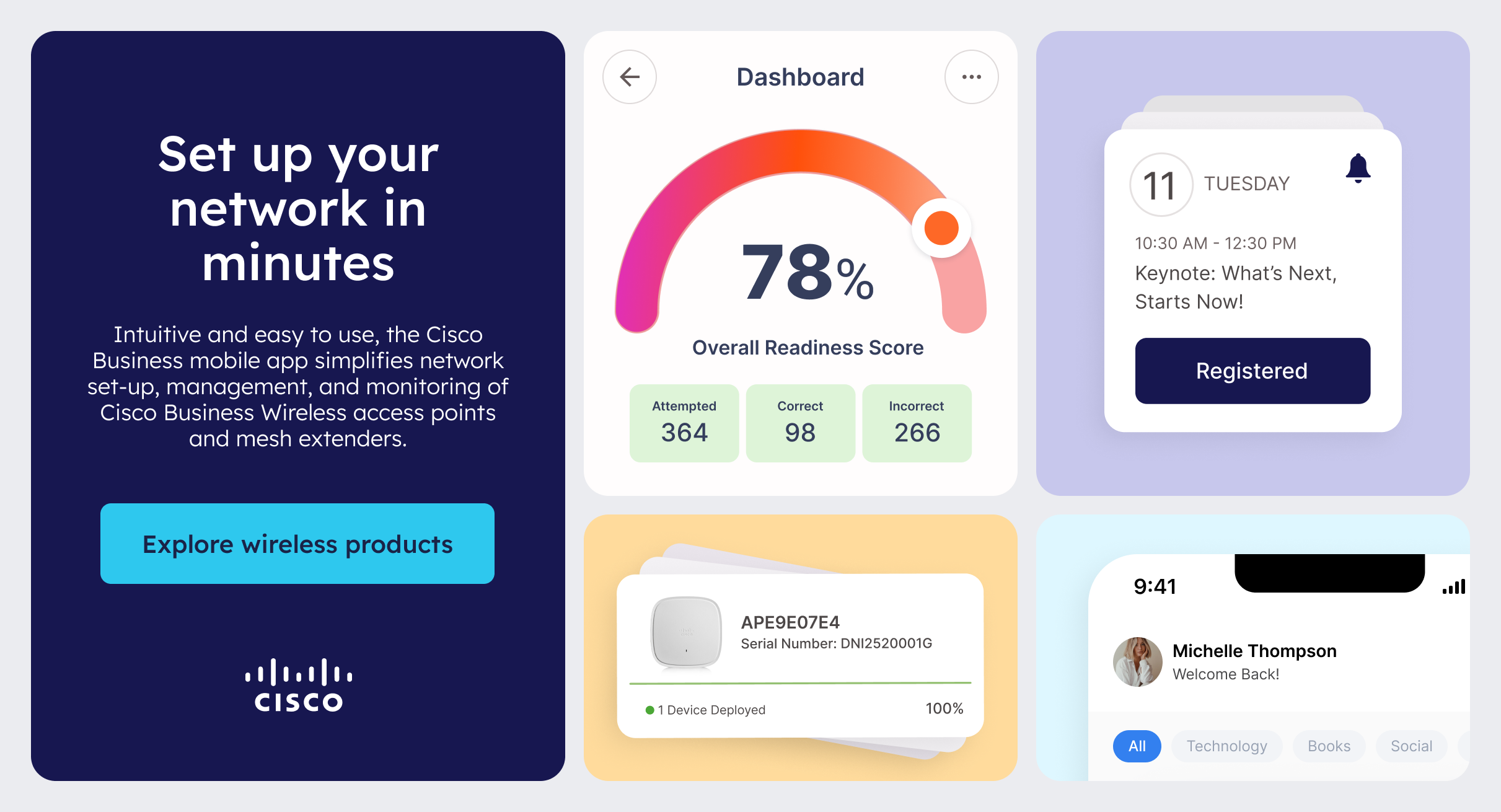
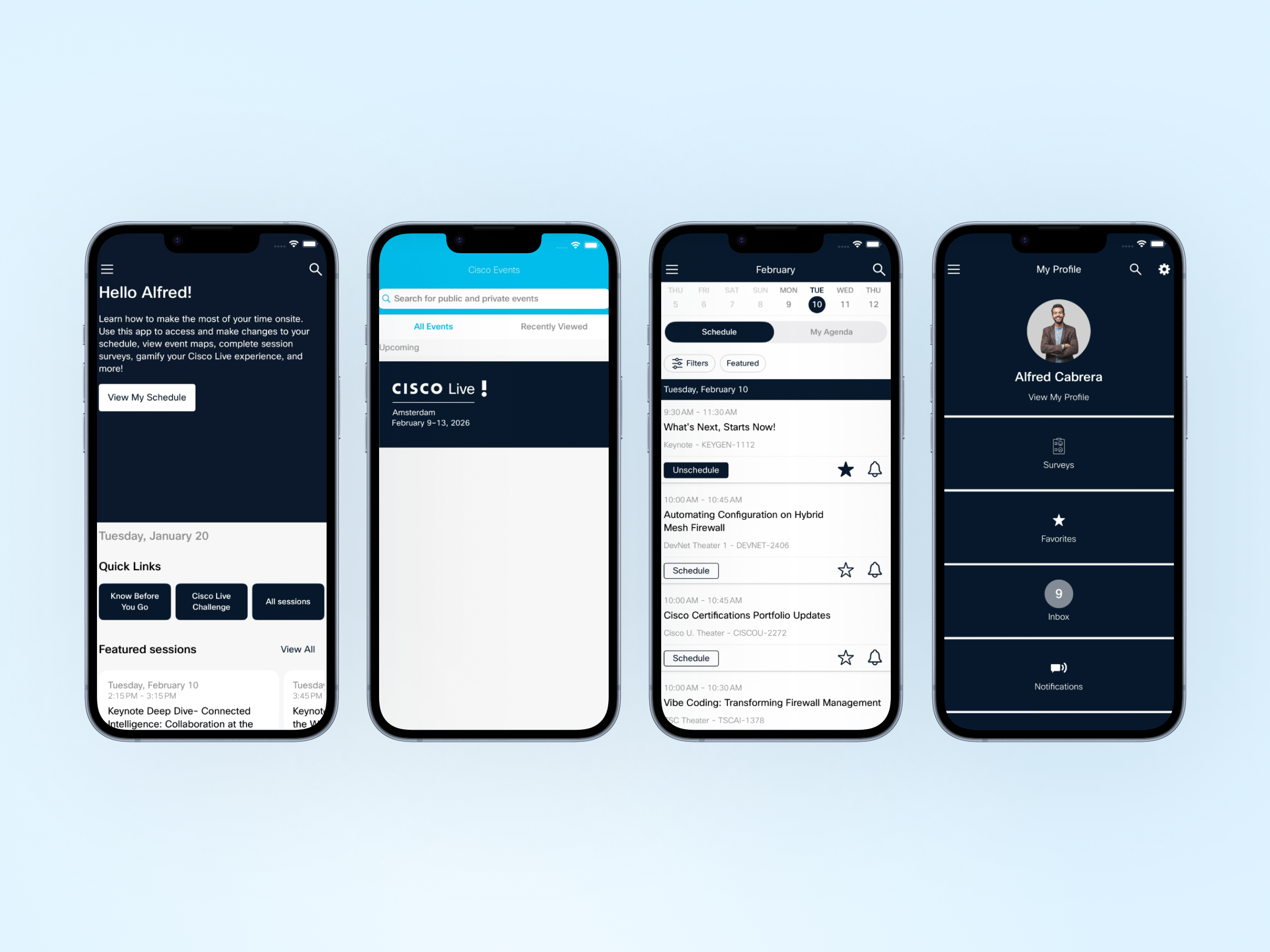
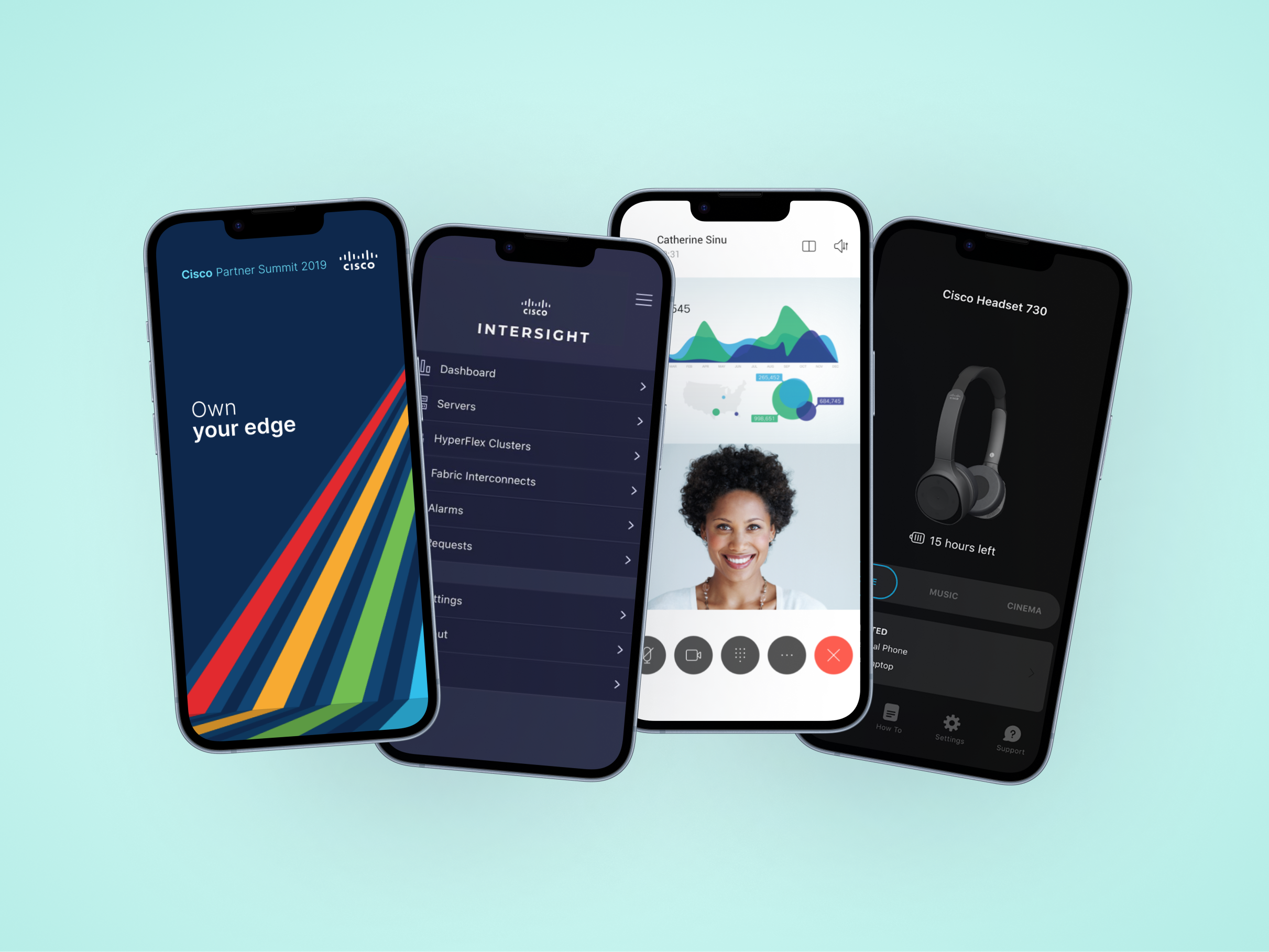
iOS | Navigation | Accessibility
The app had confusing navigation with non-standard patterns and poor thumb reach accessibility, leading to user frustration and low adoption.
Before
Top-aligned navigation (poor thumb reach)
Non-standard icon usage
Hidden primary actions
Inconsistent navigation patterns
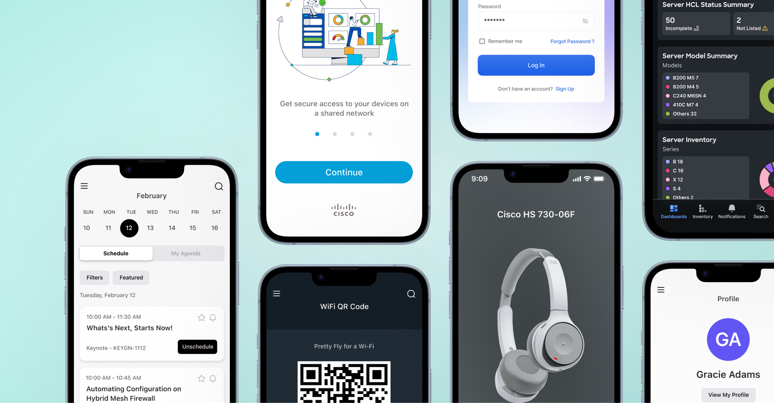
After


45% - Reduction in support tickets

4.2→4.7 - App Store rating increase

30% - Faster task completion

60% - Better brand recognition
Key principles for creating effective mobile app icons
App icon used complex photographic elements and multiple colors, making it unrecognizable at small sizes and inconsistent with platform guidelines.

Focus on a Single Element
Choose one core element that represents your app and simplify it into a clean shape. Add details sparingly, as complex shapes can be hard to read at small sizes.
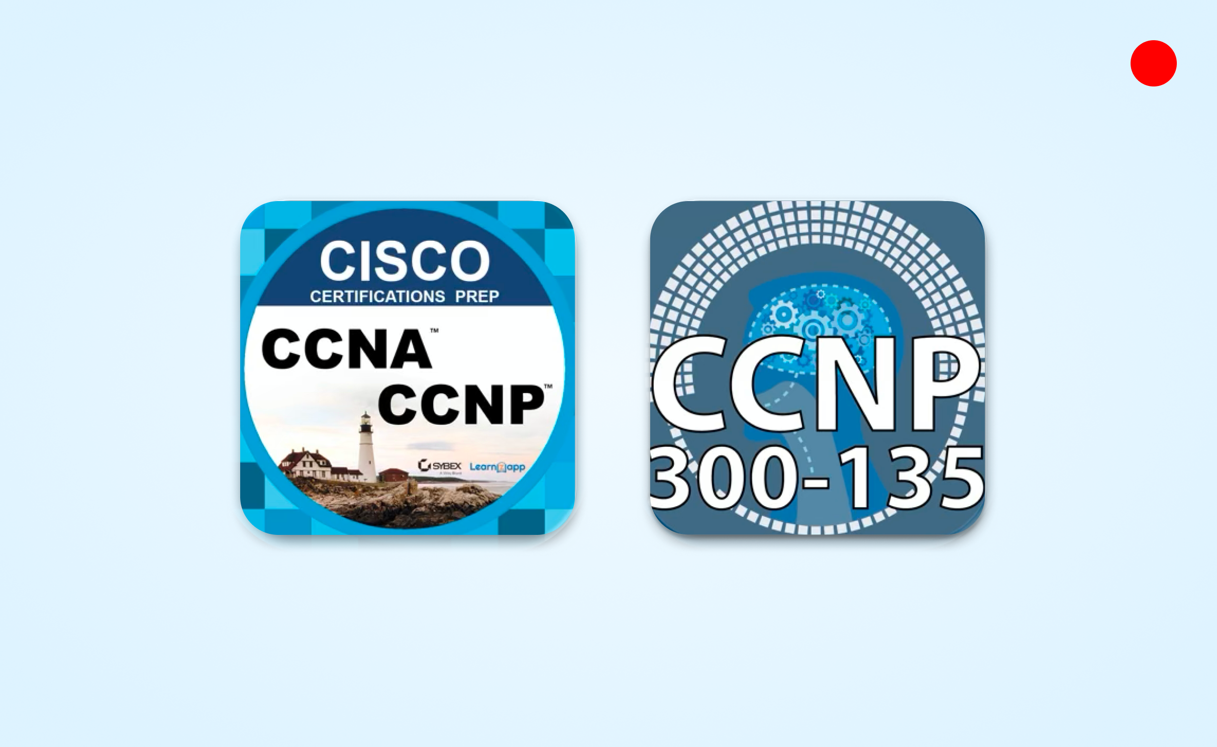
Avoid Photos or Screenshots
Photographic details and interface elements are difficult to see at small sizes and can cause confusion for users. Stick to a clear, symbolic representation.

Keep it Simple
Less is more. Avoid clutter or unnecessary embellishments. A simple, memorable icon performs better across all sizes and contexts.
Standardization drives adoption: Clear guidelines and limited variations help users create better content faster
Data-informed design: Analytics helped prioritize component features and placement strategies
Scalability requires constraints: Smart limitations empower users without sacrificing brand integrity
Documentation is design: Comprehensive usage guides are as important as the components themselves

HubSpot - Design Strategy

Cisco - Design Systems

Instashop - Case Study