Cisco Design System “Pubhub”
Role: UI Designer | Date : 2018 - 2019 | Client: Cisco

Role: UI Designer | Date : 2018 - 2019 | Client: Cisco
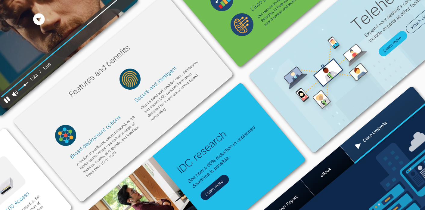
Cisco Publication Hub is a unified design system and component library built on Adobe Experience Manager (AEM) that enables non-technical publishers to create professional, on-brand web pages without developer support.
As the lead designer, I was responsible for the platform's launch and ongoing evolution—from initial concept through implementation. I collaborated closely with stakeholders across marketing, engineering, and brand teams to ensure the system met diverse needs while maintaining consistency across Cisco.com's 10,000+ pages.
Before Pub Hub, Cisco publishers faced significant obstacles:
12 different tools created inconsistent experiences across the site
3-week turnaround for simple page updates requiring developer intervention
Poor performance: slow load times and low mobile scores
Brand inconsistency across thousands of product pages
No scalability as product teams grew globally
We created a unified system that:
One platform with drag-and-drop components—no coding required
Days instead of weeks for page creation and updates
Built-in performance: SEO optimization, fast loading, mobile-first
Automatic brand compliance through component guardrails
Self-service publishing scaled to 200+ users globally
Results
How Publication Hub transformed content creation at Cisco
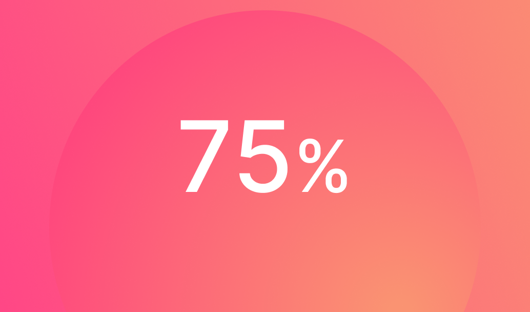
75% - Faster page creation time

300+ - Pages launched in year one
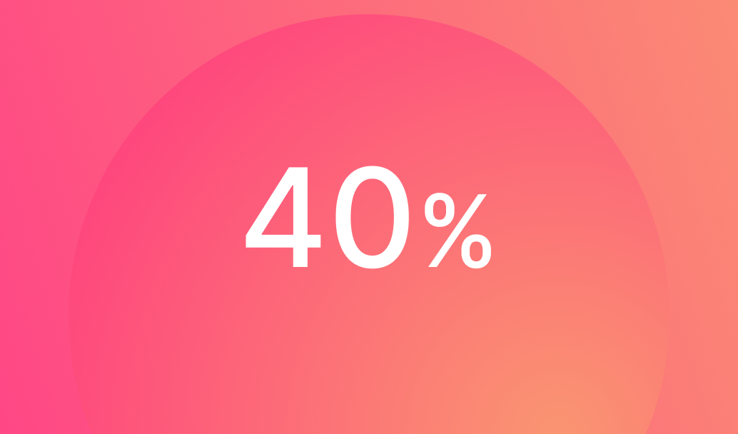
40% - Improved page load speed
Onboarded 200+ non-technical publishers across 6 countries
Increased mobile traffic engagement by 35%
Improved SEO rankings for 80% of migrated pages
Reduced design and QA tickets by 60%
Became the standard template for all Cisco product category pages
Eliminated brand compliance violations on new pages
Approach
How we built a system that scaled across the organization

Research - Interviewed 30+ publishers to understand pain points and workflows

Audit - Analyzed top-performing pages to identify patterns and components
Design - Created flexible components with built-in brand guardrails
Test & Iterate - Ran usability tests and refined based on publisher feedback
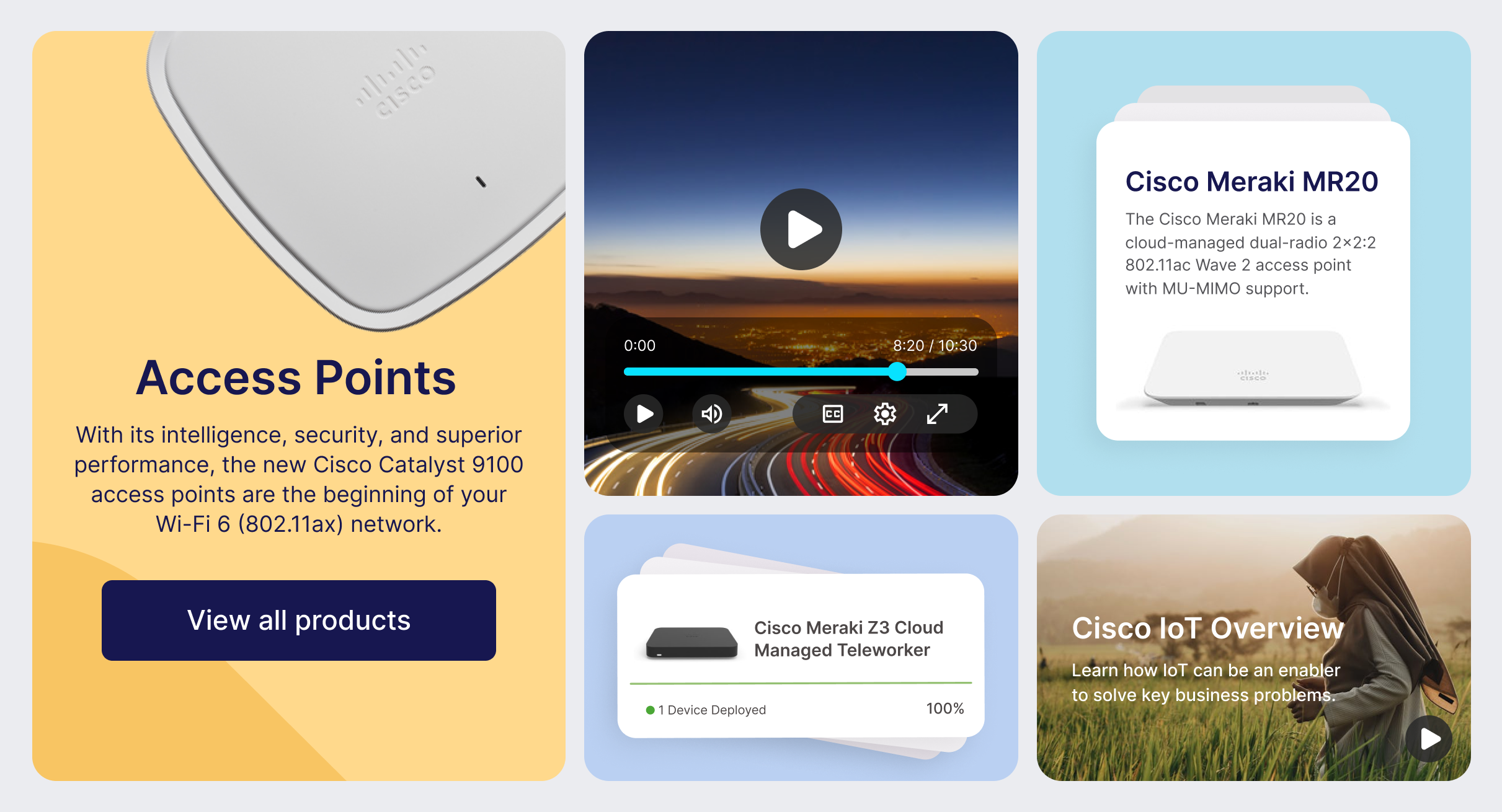
Components
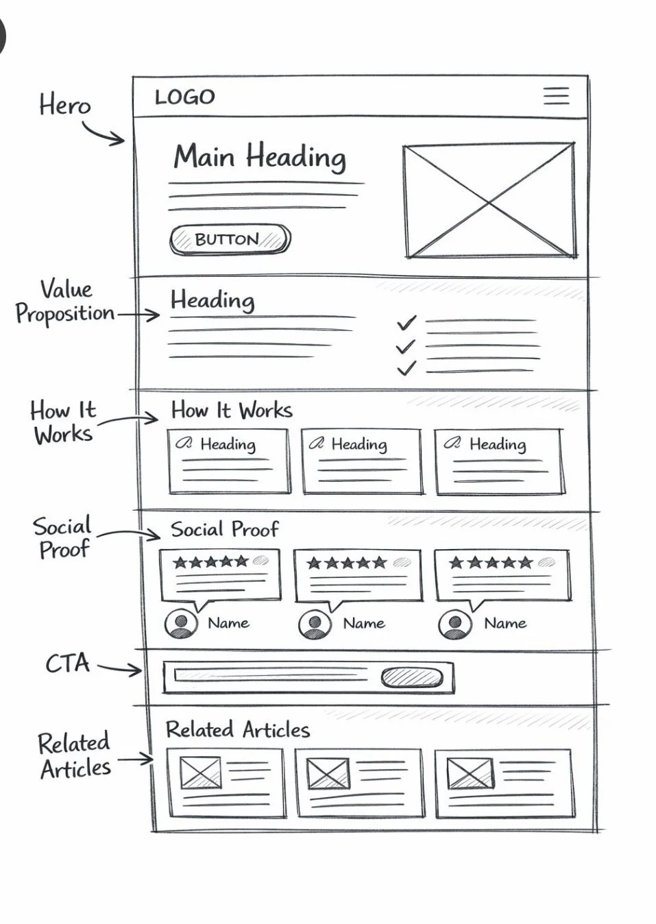
The Challenge - Publishers needed a hero section that worked for both high-impact product launches and evergreen technical content—two very different use cases with conflicting needs.
Design Decision - I created a flexible marquee system with customizable text positioning and optional video support. This allowed marketing teams to create visual impact while technical teams could prioritize clarity and information density.
Responsive text sizing that adapts to mobile viewports
A/B tested CTA placement (top vs. bottom performed 23% better)
Accessibility-first color contrast validation system
Optional video lightbox that doesn't impact page load


All elements are required unless labeled as optional. Turn on redlines in the component layer for pixel padding and margin dimensions.
Module headline
Publishers needed a hero section that worked for both high-impact product launches and evergreen technical content.
Module headline
Publishers needed a hero section that worked for both high-impact product launches and evergreen technical content.
Module headline
Publishers needed a hero section that worked for both high-impact product launches and evergreen technical content.
Module headline
Publishers needed a hero section that worked for both high-impact product launches and evergreen technical content.
The Challenge - Publishers needed a hero section that worked for both high-impact product launches and evergreen technical content—two very different use cases with conflicting needs.
Design Decision - I created a flexible marquee system with customizable text positioning and optional video support. This allowed marketing teams to create visual impact while technical teams could prioritize clarity and information density.
Responsive text sizing that adapts to mobile viewports
A/B tested CTA placement (top vs. bottom performed 23% better)
Accessibility-first color contrast validation system
Optional video lightbox that doesn't impact page load
All elements are required unless labeled as optional. Turn on redlines in the component layer for pixel padding and margin dimensions
Module headline
Publishers needed a hero section that worked for both high-impact product launches and evergreen technical content.
Module headline
Publishers needed a hero section that worked for both high-impact product launches and evergreen technical content.
Module headline
Publishers needed a hero section that worked for both high-impact product launches and evergreen technical content.
Module headline
Publishers needed a hero section that worked for both high-impact product launches and evergreen technical content.
System Architecture
Creating a structured system that guides publishers to build high-converting pages
The Challenge - Publishers needed a hero section that worked for both high-impact product launches and evergreen technical content—two very different use cases with conflicting needs.
Design Decision - I created a flexible marquee system with customizable text positioning and optional video support. This allowed marketing teams to create visual impact while technical teams could prioritize clarity and information density.
Key Features
Responsive text sizing that adapts to mobile viewports
A/B tested CTA placement (top vs. bottom performed 23% better)
Accessibility-first color contrast validation system
Optional video lightbox that doesn't impact page load
Reflection
Data Drives Adoption - Showing publishers that Pub Hub pages performed 40% better in SEO and load speed was more convincing than any design argument. Leading with metrics accelerated buy-in across skeptical teams.
Constraints Enable Creativity - Initially, publishers wanted unlimited customization. By constraining options to tested, high-performing patterns, we actually empowered faster, better decision-making. The "creative freedom paradox" proved true—less choice led to better outcomes.
Training is Product Design - The system's success depended as much on training materials as the components themselves. I learned to design documentation, tutorials, and onboarding as carefully as the UI—these were critical product surfaces.
Scale Requires Iteration - We launched with 12 components. Over 6 months, user feedback revealed edge cases and new needs. Building a feedback loop and quarterly updates was essential to maintaining publisher trust and system relevance.

HubSpot - Breeze Visual Design

HubSpot - Design Strategy

Cisco - Mobile Apps